haykranen.nl 3.0
The last big redesign of this website was released on january 1st 2007. Quite a long time ago, considering Facebook was still in its infancy, people surfed with Internet Explorer 6 and the iPhone wasn’t released yet (that happened nine days later).
So, what kept me from redesigning this site? I guess a lack of time, or interest, or both. I’ve started work on this new redesign somewhere in autumn 2011, and the files on my laptop tell me i’ve been thinking about a new design since at least summer 2010.
For this new design i decided to go with the mobile first approach: focus on the most important stuff first, make that as nice and simple as possible, than go for fancy bells and whistles. Try viewing this website on your phone or tablet, it will look pretty nice as well.
This also means performance and bandwidth is really important. The current homepage loads under a second and uses as little HTTP requests as possible. I’ve switched to using Zepto instead of jQuery as a Javascript framework for reduced filesize and optimization on mobile.
I’ve switched to English for the main pages and navigation. I’ve tried a multi-language approach for the old site and failed. I’ll still be blogging in Dutch from time to time, but i won’t be bothered by trying to invent some way to make the common interface elements available in both languages.
I’m interested to hear what you think about this redesign. Are you missing anything? Things you don’t like? Please let me know in the comments.
And i surely hope the next redesign won’t have to wait until 2017 :)
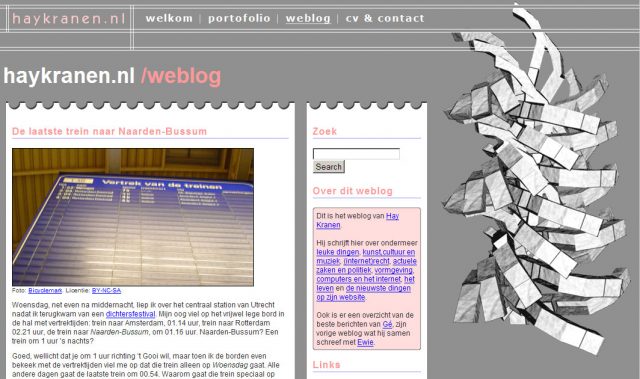
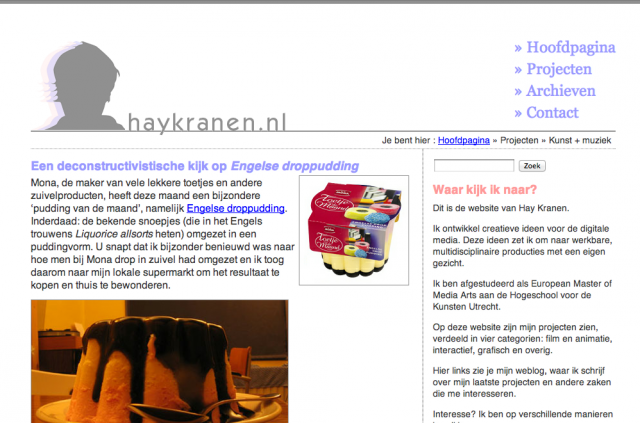
For those of you who are experiencing nostalgia now, here are some screenshots of previous versions of the site (click for a bigger version):
Version 2.0 (designed end 2006)
Version 1.0 (summer 2005)


tom
Hayveticaaaaahhhh!!!! :)